Top 10 WrestleMania Logos Of All Time
WrestleMania, the annual extravaganza that captivates millions of wrestling fans worldwide, isn’t just about the jaw-dropping matches and larger-than-life moments; it’s also about the visual spectacle that accompanies it: the iconic WrestleMania logo.
Throughout many years, WWE has debuted spectacular lineups of logos, which are constructed to reveal the atmosphere and magnificence of the championship in their own artistic fashion. In anticipation of WrestleMania 40, I invite you to join me briefly as we go through a virtual trip through history by discussing the top ten WrestleMania logos of all time.
- WrestleMania 36:
The logo for WrestleMania 36 particularly dared to be different with its simple and somewhat unconventional design in relation to the old, complicated, and mysterious logos from the previous ones. Yet, this simplicity won over every heart that night, reflecting the magnitude of these challenging times.
During a time when the coronavirus global pandemic engulfed the world, WrestleMania 36 became the only exception to have a completely empty audience, as it was not the case for any other. Notwithstanding the unavailability of standing near us cheering, the branding served as a super symbol of putting a show on, even during difficult times.
- WrestleMania 33:
The logo of WrestleMania 33 showed perfectly what the event is all about. It was a dynamic and exciting design that fully met the thrilling theme of “The Ultimate Thrill Ride.” The colourful swirling roller coaster bound with the traditional WrestleMania “W” ensured viewers’ a chance to live a lifelong memory.
This space setting made an arena for the fast action to come and, at the same time, delivered that adrenaline-stimulating combo, which is WrestleMania’s uniqueness, each and every year. Mania 32 not only hinted but also dramatically implied the experience that was supposed to be the showcase of immortals, which, compared to all the previous performances, was really out of this world!
- WrestleMania 28:
The logo of WrestleMania X 28 melted the hearts of the fans, as they could easily connect with the summery colours and beach shore backdrop using their own imaginations. The logo captured fully how the respective city here welcomed everybody with great vibes from the tropics, signifying the humongous outburst of the event.
Featuring a vibrant and colourful design, the logo for WrestleMania 28 made the fans want to push each other closer to the sun and immerse themselves in the exciting atmosphere that comes with the Show of Immortals event. It looked absolutely amazing and totally caught WrestleMania’s peculiar essence, which blends athletics, entertainment, and mega size into one unmistakable combination.
- WrestleMania 14:
It has turned out that the design of the WrestleMania 14 logo is simple, but does it matter as far as the meaning is concerned? The emblematic “XIV” design strung with the wreath looked over the top to highlight the WrestleMania decades of existence. It was another way to remind the fans about the historical aspects of the event.
The logo kept away from ostentatiousness, but it could claim the classic look of endurance and honor. The emblem of WrestleMania 14, a commemoration of the event’s previous years, acknowledged the stadium’s importance as the biggest platform in professional sports.
- WrestleMania 31:
The iconic WrestleMania 31’s logo wanted to say the WWE was entering a brand-new era, and to do so, it utilised an elegant and modern theme. The insignia, besides, captivated the spectator’s imagination as it bore testimony to the adventurous pioneering tale with the promise of a visual extravaganza before the spectators.
Its glittering sheen and fashionable identity as WrestleMania 31 were the sign of a new bold direction that would eventually provide an unforgettable match for the fans. It was a classic representation of the company’s disregard for the ethics of the wrestling business and their willingness to go out of line to give an innovative show to the audience on the biggest stage.
- WrestleMania 24:
There could not have been a better symbol to represent WrestleMania 24 than an illustration of magnificence with its glorious sunset backdrop lying on the large logo. As the catwalk to what has been previously referred to as “the grandest stage of them all,” the logo provided the audience with a sense of joyous anticipation for the mighty encounters that were yet to happen. An event of such magnitude was reflected in the colours and bold nature of the logo. Its glamorous posture promised fans a faithful recreation of those unforgettable moments that took place once upon a time. This was a marvellous visual rendition of wrestling Mania and perfectly emulated the power and excitement of the moment.
- WrestleMania 3:
Compared to the previous editions, WrestleMania 3’s logo carried a more dynamic touch. It boasted a strong ‘III’ circled by stars, underscoring the essence of the event. The venue was the Pontiac Silverdome, where more than 90,000 people were present as witnesses to the event. Such a historical moment was created in wrestling history.
The logo’s solid look amplified the atmosphere of the event to an extravagant level, and its logo would be rightly written in the history of the fight. The logo with battling male and female figures for WrestleMania 3 was so successfully designed because it expressed a strong association of this heavyweight event with the history of both American culture and the whole world.
- WrestleMania 21:
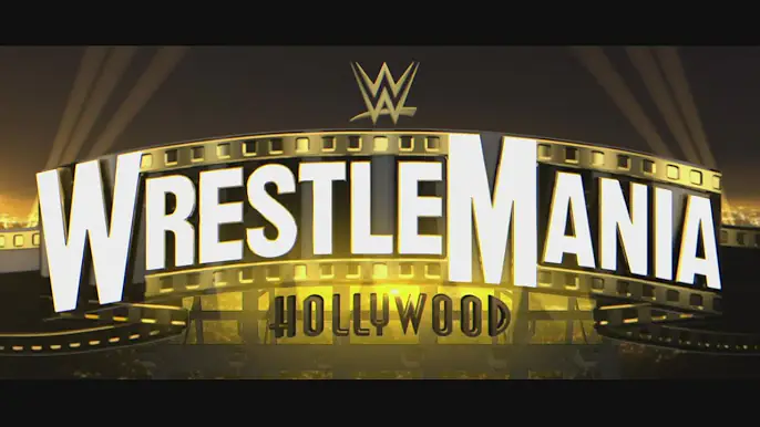
Literally, the logo of WrestleMania 21 coldly symbolised the emerging maturity of the event, inspired by the dazzling Hollywood luster. The logo depicted this unique emotion in an appropriate manner, of course, promising die-hard fans a sumptuous and free-lance extravaganza that no one has witnessed or participated in before.
The intricate logo of WrestleMania 21, which offered a taste of the unique elements of the entertainment industry, served as the avenue through which the viewers were given a total package of unforgettable moments and unforgettable memories. It was a symbol of WWE’s pledge to remain the sporting entertainment provider who does the job perfectly, for it is the Kumite of all Kumites.
- WrestleMania 17:
Wrestlemania 17’s logo was a visual representation of wrestling’s provocative feeling with its decent Fiery Red colour, shape, and thrilling design. This WrestleMania event is usually described as one of the best out of all the WrestleManias. In addition to being a showcase for rebellion, attitude, and big-personality characters, it was extraordinary enough.
The logo, to be memorable and catchy, had to be bold in the design and colour arrangement so as to portray the essence of the era, promising the fans a night of action and excitement. The logo for WrestleMania 17 is now a piece of “memory baggage” for every single fan on the planet, since it sums up an era noted for the breaking of conventional rules and turning every corner in the field of professional wrestling into a stage for the wildest acting out.
- WrestleMania 30:
The logo of WrestleMania 30 celebrated the event’s milestone and represented it in an interesting way through the vibrant, golden “XXX.” Their logo was simply sensational. It captured the end of an era not only grandly but also lovingly, in celebration of everything that happened in the last decade.
The logo that represented WrestleMania 30 was carefully designed and had an elegant and luxurious colour scheme. This logo conveyed a sense of pride and symbolised the significance and gravity of such a historic event. It not only represented WWE’s grandiose and enduring status over the years but also its ageless brand, “showcase of the immortals.”
As we are ready to watch WrestleMania 40, let us take a minute to look at the greatest WrestleMania logos in the top 10 and seize the moment. Every one of these designs writes its own story, which illustrates how Walk the Wasteland (WWE) has changed through time but has never ceased to exist. Whether it is modern and fantasy or classic and memorable, These logos have etched their way into the minds and hearts of wrestling enthusiasts globally and secured that WrestleMania will remain bright and successful forever.
